paralyzed by all the decisions


I'm currently trying to figure out what fabrics to use in the red/white/blue/pink kitchen, and I just cannot make a decision.
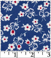
Do I want a kicky feedsack reproduction print, like one of these?


Or do I want a strong graphic element? I'm loving the two prints on the right together, but would that be overkill? And is that red too orangey? Should I maybe use the pink print on the left, and pair it with white eyelet or maybe red sashing?


Or should I try a small blue and red print? I like the two on the ends better than teh one in the middle, but would the flower provide a good counterpoint to the very graphic prints? I love the retro feel of these, but there's really no pink at all in them....on the flip side, they would tie in nicely to the yellow office next door.
Le sigh. All these choices. I think part of my problem is that I don't know what the colors will be when I only see them on a computer monitor, and also that I have to look at real fabric to know what will work together and what won't
All images courtesy of sewmamasew

Comments

Who me? said…
I love the first fabric. I would do that one.
Anonymous said…
I like the middle row of prints the best, the middle print especially. I personally would avoid the small floral (especially feedsack) prints; that color scheme can become country-town Americana really easily, and I don't think that's what you want. Although I will say, I do like the first picture in the third row. Ack! I don't envy you the decision-making!
lsaspacey said…
Show the kitchen and we can make better informed suggestions. :)
I personally love the combination of the last one in all three rows together. I've been tempted to buy the oval polka dots (my favorite) to make a shirt for a while now.
Anonymous said…
I'm loving the middle prints as well. I think I'm inclined to use such showy fabrics regardless of the setting, though :)
joy said…
I also love the middle prints. I was thinking the same as Kelly about the tiny prints looking too Longaberger basket-ish. Also, I think the graphic red prints in the middle row are not only exceedingly cool, but very you-ish. As in, they seem to go more with the rest of your personal style than some of the other fabrics.

My vote? middle row fabrics.
Anonymous said…
P.S. I thought you should know . . . I was doing some fabric shopping for my own purposes, and found that the Amy Butler fabrics (middle row) read much lighter on other sites - more dark pink than red. That said, I still like them best . . .
VDOprincess said…
thanks for all the advice, people! The top right fabric was on clearance and there was only a yard left, so I ordered it (although I don't think it's going to be the main motif--it was just too cute to pass up completely). At the same time I ordered some quarter-yard pieces of oilcloth to check colors for my desk, figuring I can always turn the pieces into makeup bags/christmas gifts.
So anyway, with all that they're sending swatches of the middle three, so maybe I can do a color check soon!

Popular Posts