what I've been reading
Cath Kidston's In Print. Love. This. Book. Each page uses a vintage fabric as the background, and that in an of itself would be wonderful. But that's not all. She uses vintage fabrics throughout her home, and has lovely ideas for adding color and life to your surroundings.
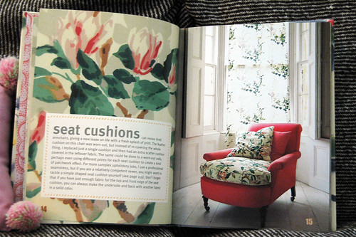
This is the first photo that enthralled me. What a perfect way to use a small amount of fabric to add a punch! The whole chair in that floral would be a bit much; just a throw pillow, while nice, wouldn't have quite the same impact. I love this concept, and hope I'll get the chance to use it. I'm also picturing using two prints on the same piece of furniture. Yes, it could be tricky, but imagine black twill with black-and-white toile? Not too precious, but not too sharp, either.
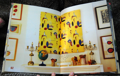
I've often heard of using framed fabric in lieu of artwork, but I always thought it had to be a really huge pattern. Apparently not; this looks lovely. I especially like how she mirrored the quirky lines of the fabric in with the candlesticks and sculpture-thingy.
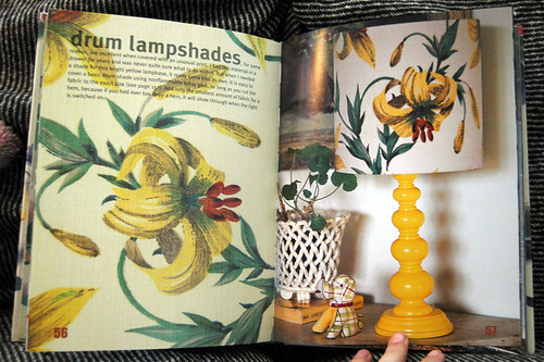
Clean lines, strong print. Imagine the same lampshade in a smaller floral or check? Ugh. It would be entirely too sweet. The strong image, while overpowering if used on a piece of furniture, adds punch to this shade.
I guess what I'm learning from this book is to rethink how I use fabric and to try unexpected combinations.
This is the first photo that enthralled me. What a perfect way to use a small amount of fabric to add a punch! The whole chair in that floral would be a bit much; just a throw pillow, while nice, wouldn't have quite the same impact. I love this concept, and hope I'll get the chance to use it. I'm also picturing using two prints on the same piece of furniture. Yes, it could be tricky, but imagine black twill with black-and-white toile? Not too precious, but not too sharp, either.
I've often heard of using framed fabric in lieu of artwork, but I always thought it had to be a really huge pattern. Apparently not; this looks lovely. I especially like how she mirrored the quirky lines of the fabric in with the candlesticks and sculpture-thingy.
Clean lines, strong print. Imagine the same lampshade in a smaller floral or check? Ugh. It would be entirely too sweet. The strong image, while overpowering if used on a piece of furniture, adds punch to this shade.
I guess what I'm learning from this book is to rethink how I use fabric and to try unexpected combinations.

Comments